
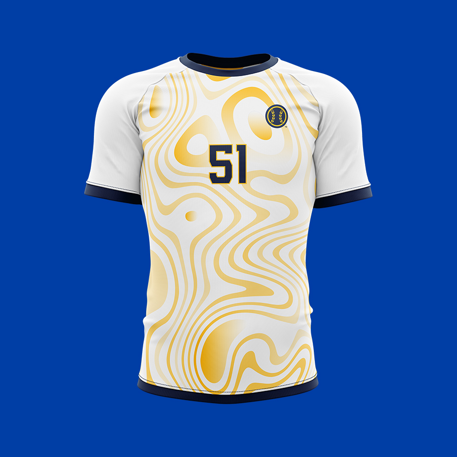
The biggest challenge with any all fan giveaway item is coming up with a design that will appeal to everyone. Removing personal bias and relying on feedback from many internal stakeholders was important to this designs success. Another factor was considering the jersey material. These kind of giveaways are often using cheaper materials to cut costs. That helped us eliminate any light base colored design because it was easy to see through the material.
Eliminating light base colors really helped narrow the design decision down to something that was simple and very on brand. For the base of the jersey, I worked in a sublimated home plate pattern. A very common trend in soccer jersey design. Using the Milwaukee script mark was important as well so that even if someone wasn't a big Brewers fan, they could still wear this to represent their love for Milwaukee without it saying Brewers on it. The last touch was the wheat mark running up the outside of the sleeves. An element that isn't often found on Brewers apparel outside of the Wheat ball logo.
I grew up playing soccer, so this was a fun one to work on. In total, I explored over 40 designs, but I love where we landed. Take a look below at some of my other favorites from the process.


This is where the brand philosophy text will go. This is where the brand philosophy text will go. This is where the brand philosophy text will go.
LET'S TEAM UP!