
The EPIC Bucks were an affiliated AAU team to the Milwaukee Bucks through the E.P.I.C. (Every Play Is Crucial) AAU basketball program. The biggest challenge was designing a team identity that fit in with the Milwaukee Bucks identity, but was significantly different. The approach here came down to utilizing a completely different logo style while working in subtle Bucks aesthetics.
Unfortunately, this league is no longer active. Despite that, this was still a very challenging and fun team identity to create!
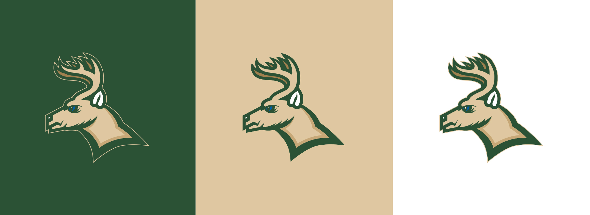
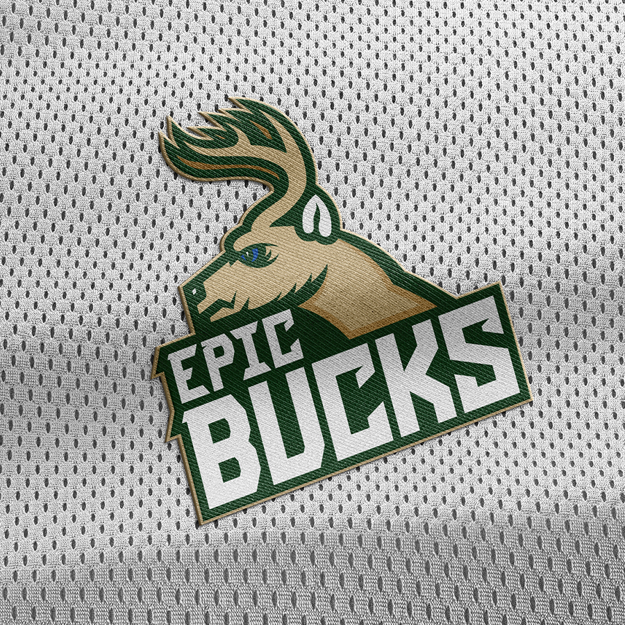
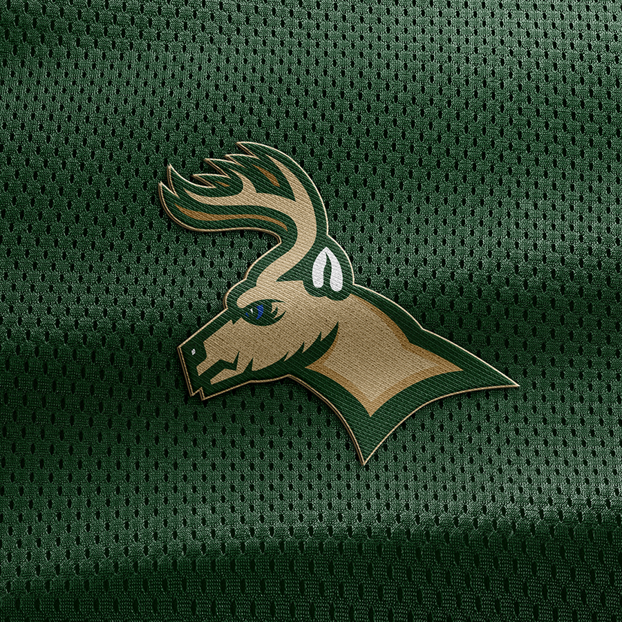
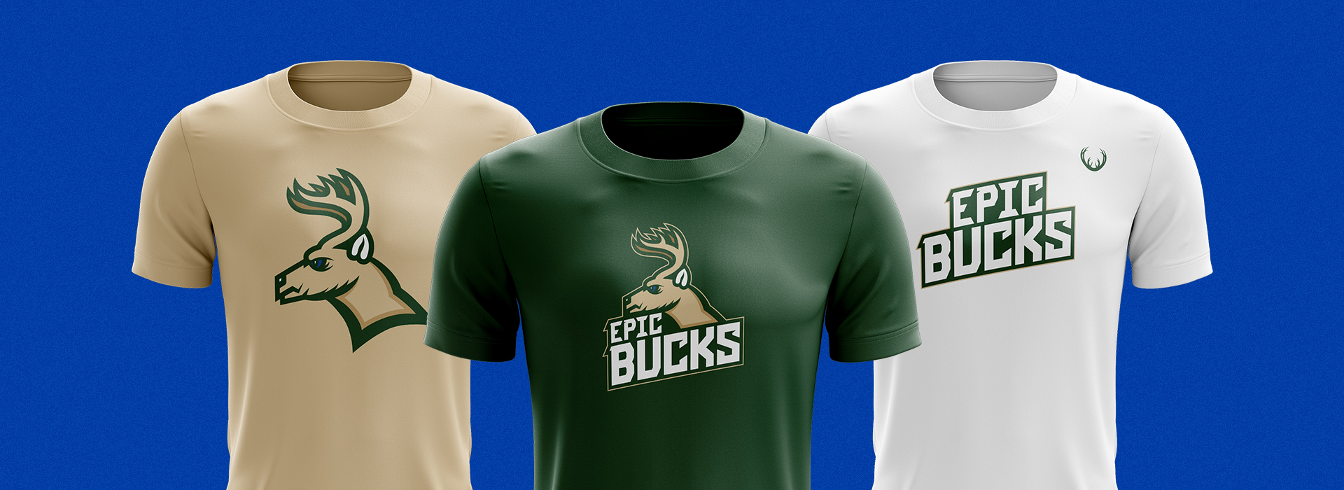
The main nods to the Milwaukee Bucks aesthetic comes from the same color palette, the structure of their brand font and a thin outer cream stroke where applicable. From there, the deer was created from a different perspective with added depth through additional darker tones. The typography was adjusted and stylized from the Bucks main brand font to be edgier with slashes and appeal to a younger audience.
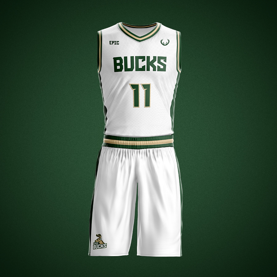
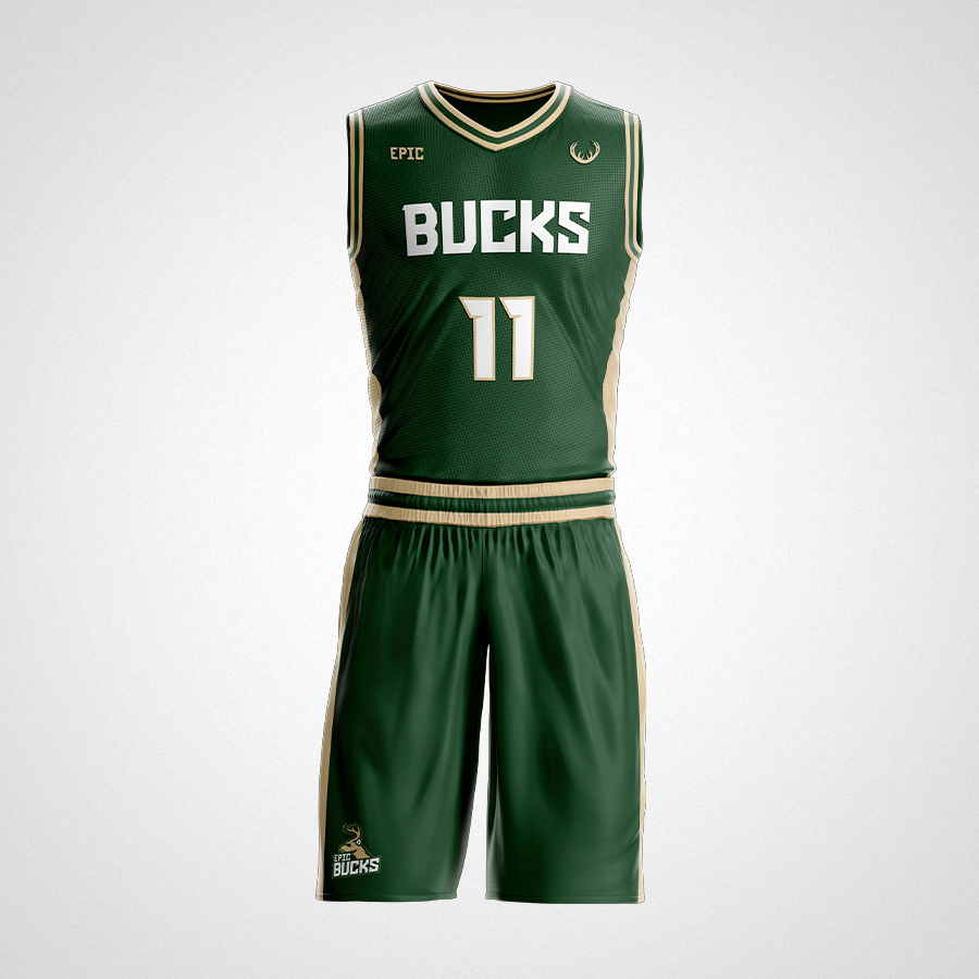
Take a look below to see the full team identity and simple home and away jerseys.




This is where the brand philosophy text will go. This is where the brand philosophy text will go. This is where the brand philosophy text will go.
LET'S TEAM UP!