
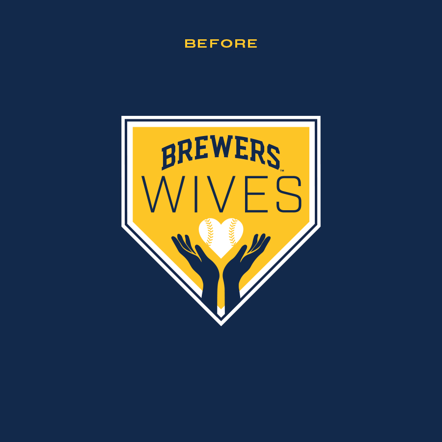
Most professional sports teams have tight-knit community groups specifically for their players partners. These groups are a great way for the players partners to connect and volunteer in their respective communities. The Brewers group was originally called, Brewers Wives. In 2024, they wanted to transition that to Brewers Families to be more inclusive. The biggest challenge with these kind of logos is often trying to visually communicate what the group stands for and keeping it as simple as possible.
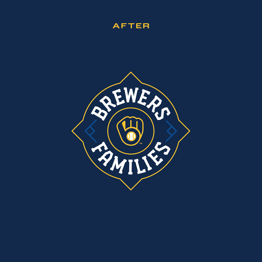
Through the combination of thin strokes and simple baseball relevant shapes, I was created a unique holding shape for this logo that symbolized community and baseball. And with the additional of base icons, it symbolized the connection that Brewers Families has to baseball and the community. The result is a simplistic and unique brand logo that connects to the Brewers Families mission.


This is where the brand philosophy text will go. This is where the brand philosophy text will go. This is where the brand philosophy text will go.
LET'S TEAM UP!